Backgrounds
This Theme includes a unique background effect or animation for each style.
Specials
We've added a snazzy typo teaser and a Smoothscroll position to Luna theme.
Teaser
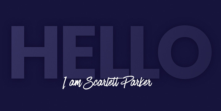
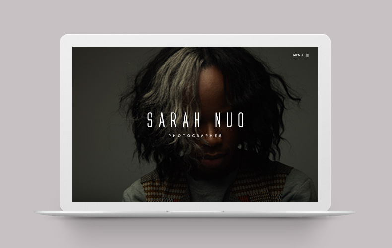
The frontpage of Luna theme opens with a catchy typographic teaser that adapts to each style. It consists of HTML text and an overlaying image, which you can replace with your own. The main heading can be styled in detail through the customizer.
<div class="tm-teaser-container">
    <h1 class="tm-heading-teaser" data-heading="my text">My Text</h1>
    <img src="/" alt="">
</div>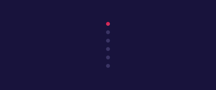
Smoothscroll
As a feature to help users navigate through long pages, we've added the smoothscroll position. Just add the following markup to a custom module published to the Smoothscroll position. Don't forget to link to the IDs of the sections that you want to navigate to.
<ul class="uk-dotnav uk-flex-column" data-uk-scrollspy-nav="{smoothscroll: {offset: 90}, closest:'li'}">
    <li><a href="#my-id-01"></a></li>
    <li><a href="#my-id-02"></a></li>
</ul>
Navigation
Luna theme comes with three different layouts for the main menu.


Layouts
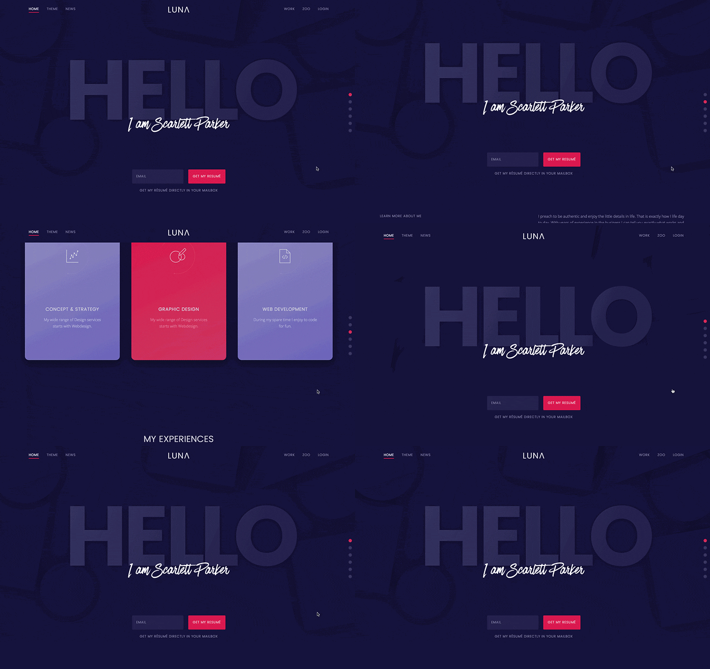
The centered navigation places the logo in the middle and distributes menu items equally on both sides. If your site has a big logo, you will probably want to use the stacked layout that places the logo above the navigation, so it has enough space. A traditional, left-aligned layout is also available. You select these options in the Warp administration.
Sticky and absolute
Of course, the navbar also comes with a sticky option, so that it remains fixed at the top of the window.
This can be combined with the Transparent option that removes the menu's background and places it on top of the content. The menu color adapts automatically to all block styles. Upon scrolling down the page the navigation will reappear with its background, if it is set to sticky mode.
Block Appearance
To add flexibility, Luna theme provides settings for each module position.
Background
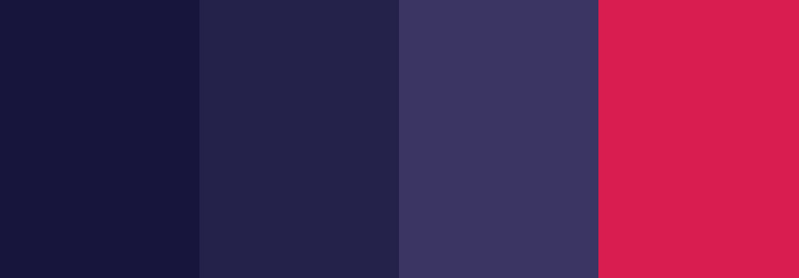
You can apply a different background color to each block.
Colors
Default, Muted, Secondary, Primary
Padding
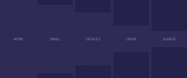
Add different paddings to each section or remove the padding altogether.
Padding
Default, Small, Large, xLarge, None
Content width
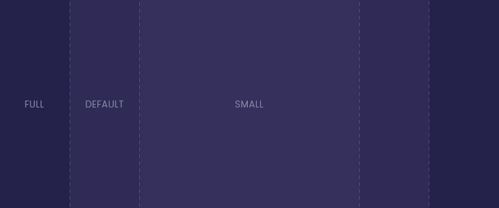
You can apply different content widths or enable full width
Widths
Default, Small, Fullwidth
Full height
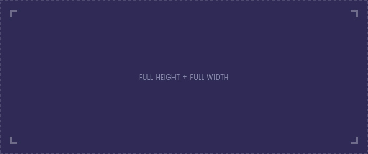
Each section contains a full height option. If combined with full width, this is great for teaser layouts or a fullscreen slideshow.
Additionally, you can apply your own class to add custom styles to a block.
Widgetkit
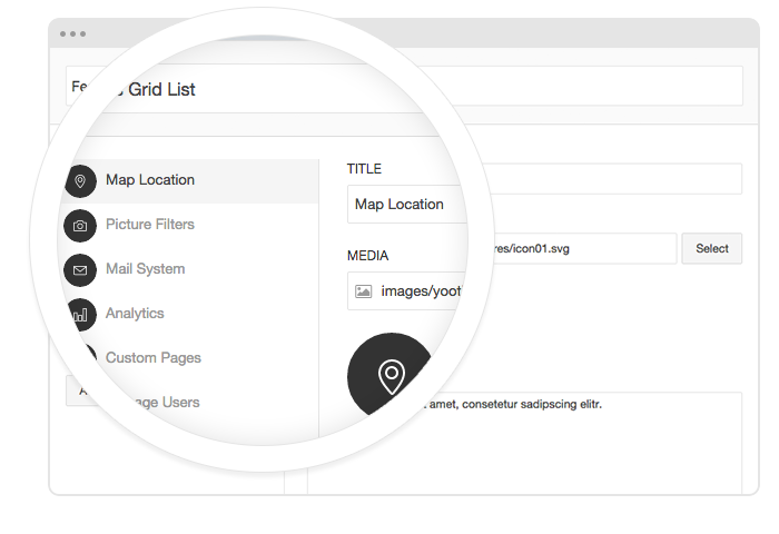
In addition to the default Widgetkit plugins, Luna provides 4 custom widgets.
Gallery
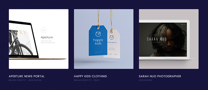
The custom Gallery widget allows you to add tags to your content that will be displayed inside a list below the title. This works with all overlay style. The default gallery options are still available as well.
Grid
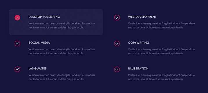
This custom Grid widget displays content inside a hover panel, meaning that the panel displays a background on hover. On the left of your content there's a check icon. This widget is great to publish a list of information in a grid layout. Note that media items will not be displayed inside this grid.
Grid Button
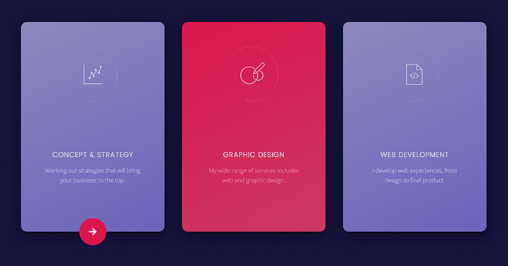
To create a grid with spinning buttons that appear on hover, as seen on the frontpage, add the .tm-grid-button class to a regular Grid widget.
List
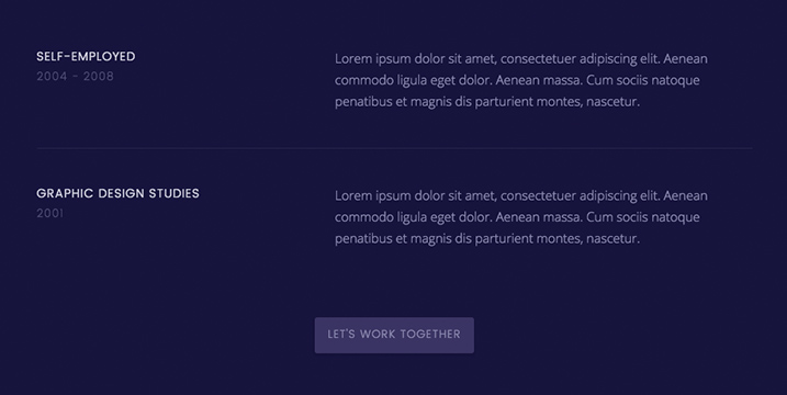
Luna theme includes a custom List widget. It allows you to publish content inside a layout that resembles a description list. Items can be separated by borders, through background colors or space. The Subtitle field allows you to display additional information below each item's title.
Slideshow
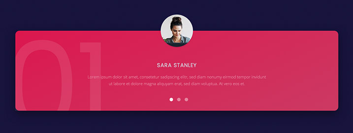
This Slideshow widget is made to display quotes or similar content. Media items are published as avatars on top of the content panel. You can select different panel styles and add a Watermark to each item by typing your own text into the custom field in the Content section of the widget administration.






Author
May 2, 2090 at 1:55 pm
Lorem ipsum dolor sit amet, consetetur sadipscing elitr, sed diam nonumy eirmod tempor invidunt ut labore et dolore magna.